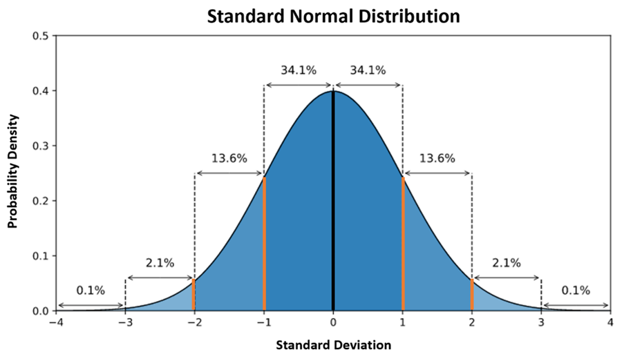
In statistics, a “normal distribution” is a type of continuous probability distribution given a set of data points. You can call this a bell curve if you choose, and it summarizes in chart-from the likelihood of outcomes given the dataset.
-
- The bell curve represents the normal distribution of outcomes and the corresponding probability density (on the y-axis).
- The x-axis are measurements of standard deviation from the average at zero.
- Line in the middle of the curve represents the average of all the outcomes.
- 1st set of orange lines represent 1 STD DEV (standard deviation) to the left and right of the average, which in statistical terms includes 68.2% of all outcomes (2*34.1%).
- 2nd set of orange lines represent 2 STD DEV to the left and right of the average, which in statistical terms includes 95.4% of all outcomes (2*34.1% plus 2*13.6%).
- The bell curve on a distribution chart may vary from being somewhat flat, all the way to having a sharp peak. The sharper the peak the lower the deviations from the average.
