
Here at RPP we take great pride in the work that goes into assessing and evaluating our pitchers and position players. This is generally reflected in the comprehensive reports we provide our athletes with in-depth analysis and summaries of their capabilities, whether it’s in the weight room or inside the nets. Our newly developed Trackman Pitching Report uses data collected from in-house bullpens to create simple visuals that can help better communicate the strengths and weakness’s of a pitcher’s repertoire. The main parts our report focuses on is:
-
- Pitching Metrics
- Pitch Movement
- Pitch Consistency
- Pitch Location
- Stuff+ Report
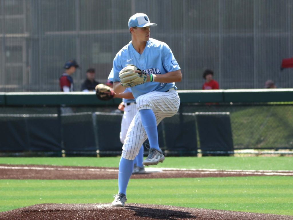
In order to best showcase these graphs we will be sharing a report from one of our summer pitching program members, Kyle Corso. Kyle is currently a member of the baseball team at Columbia University. Kyle came to us this summer to improve his overall pitching arsenal. This report was created from his final bullpen with us this summer.
1. Pitching Metrics
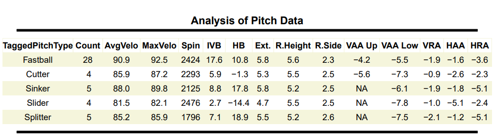
The foundational part of understanding the report and the graphs on the report we created rely on the raw data behind a pitches profile. The table below aggregates the averages of each part of a given pitches profile. In recent years coaches, scouts and management have begun to gravitate towards outliers on different parts of pitch profiles to create a more unique feel and look to each pitcher that they bring into the game. Being able to understand what sets your pitches apart is vital to creating in-game success.
The Metrics:
-
- Average Velocity (Avg Velo)
- Max Velocity (Max Velo)
- Spin Rate (Spin)
- Induced Vertical Break (IVB)
- Horizontal Break (HB)
- Extension (Ext.)
- Release Height (Rel. Height)
- Release Side (Rel. Side)
- Vertical Approach Angle (VAA Up)
- Vertical Approach Angle (VAA Low)
- Vertical Release Angle (VRA)
- Horizontal Approach Angle (HAA)
- Horizontal Release Angle (HRA)
2. Pitch Movement
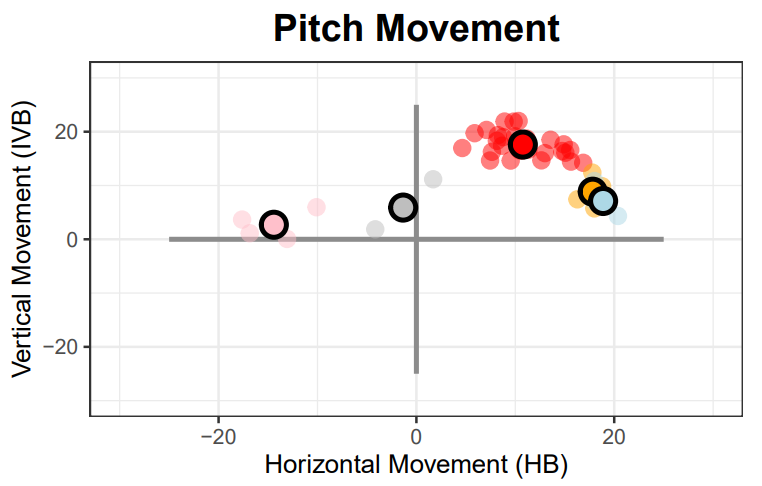
Movement Plot
This graph has color coded dots based on the type of pitch that the Trackman labeled your pitch as. There is also a circle that is outlined black on the graph for each pitch type, this circle is the average horizontal and vertical break for each pitch type that you threw in your bullpen.
When analyzing this graph we are looking for two main things which highlight pitch differentiation:
-
- Distinct pitch clusters
- Pitch lines
A pitch line is important to pitchers because we want pitch separation with unique profiles that move in similar directions with different profiles.
The first thing to take into account on Kyle’s pitch movement profile plot is his three new pitches: cutter (gray), sinker (orange) and splitter (light blue). Each having their own area on the graph is key to a new pitch.
Next is Kyle’s pitch line which consists of his slider (pink) and cutter (gray). These pitches have a different velocity range (cutter avg 85.9 mph and slider at 82.1 mph) and movement profiles in similar directions.
The next cluster is his splitter (light blue) and sinker (orange). The important difference here is the velocity. He throws his sinker at 88 mph and the splitter at 85.2 mph.
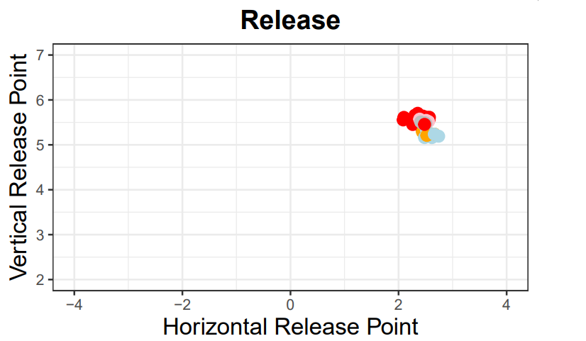
Release Plot
The graph below is a release plot. The importance behind this graph is to show the cluster or cluster where each pitch type is released from. From this chart we are looking for a single dot signifying each pitch is released from the same spot.
One of Kyle’s strengths even before he stepped through our door was his pitch release plot. He is extremely good at repeating his delivery to get highly comparable arm slots for each pitch type that he throws.
The example below is a really good example of what we want the plot to look like.
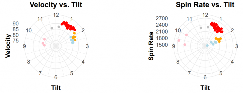
Tilt Charts
Towards the bottom of the same page you will see two similar looking charts called the tilt charts. Tilt is the direction in which the ball is spin onced released. These two charts are comparing two different metrics to a pitches tilt: Velocity and Spin Rate. With these two metrics we want to see the consistency of tilt and the second is more pitch design. Being able to create similar tilts in the right area creates the correct movement profile.
Kyle’s tilt charts used to only consist of two pitches so he spent a lot of the summer getting his pitches to have the proper tilt. Creating the correct tilt on Kyle’s new pitches helped him develop them extremely quickly. The cluster of all dots having a unique area on the tilt plot shows the difference in movement of that unique spin that each pitch will have.
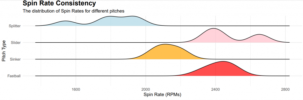
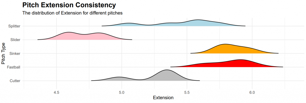
3. Pitch Consistency
On the next page is what we call our consistency charts. There are three different charts on this page that measure the ability of the pitcher to repeat the metrics they get per pitch. When you look at this chart you will notice what look to be peaks attached to a line. The larger the peak is the more times a pitcher was able to replicate that metric.
The three metrics we measure on the consistency charts along with Kyle’s charts:
Spin Rate
Extension
Velocity
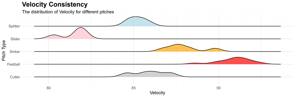
As we analyze Kyle’s graphs we will notice that some of the graphs have the proper shape to them while others can definitely be improved upon. One of the better looking examples that Kyle has is his sinker(orange) spin rate consistency, there is only one orange peak that comes off the line on that graph. An example of an area that needs some work would be the consistency of his extension on his splitter(light blue). There are a few different peaks that you can noticeably see on the line and overall no real true peak to point to any of them.
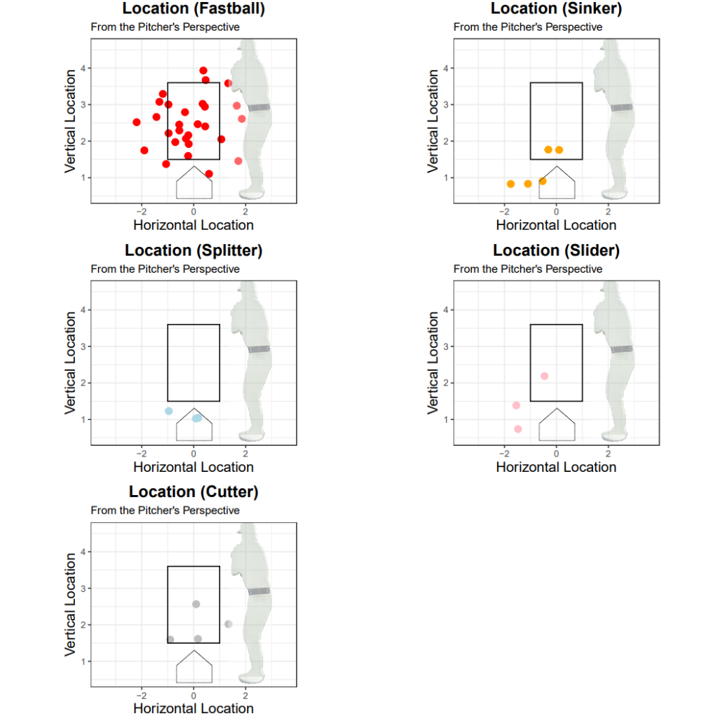
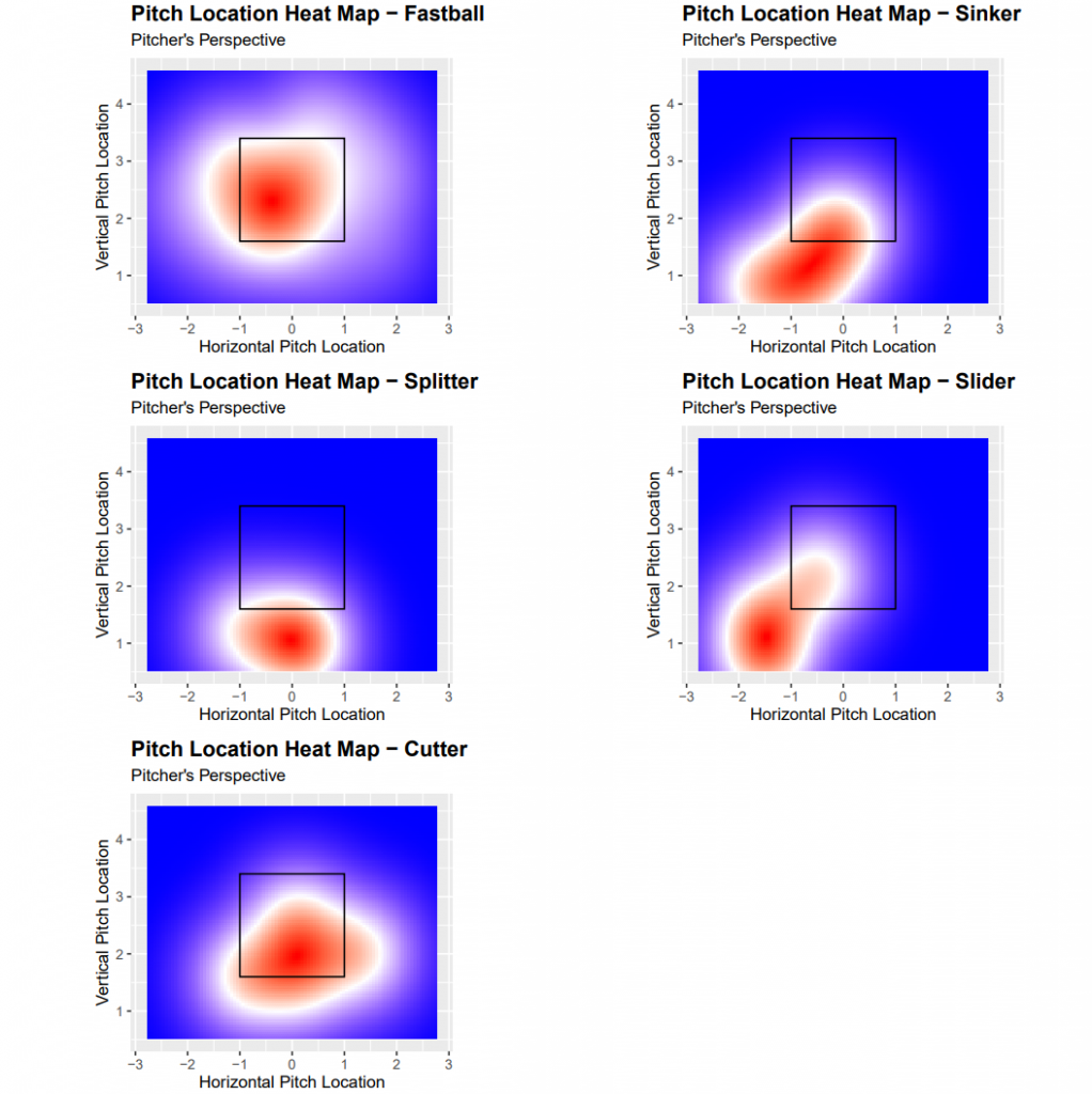
4. Pitch Location
The next two pages are purely location based. Being able to understand trends and misses can lead to many different discoveries about a pitcher.
Location Charts
The first of the location charts are just your normal plot of pitches with each pitch being represented as a dot and being split into a different plot based on pitch type.
Heat Maps
The second section is a heat map for each pitch type. The brighter the red dot means the more likely that pitch is to land in a certain spot.
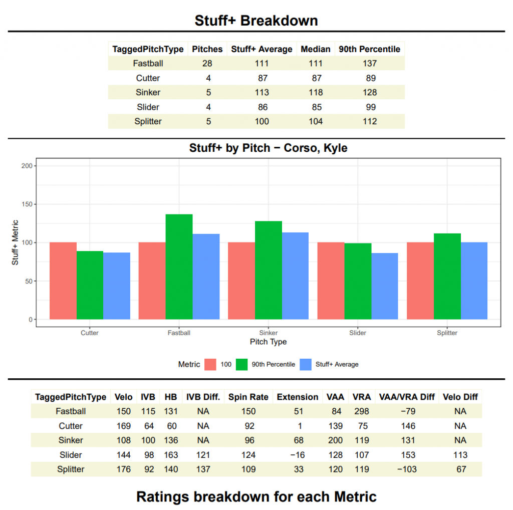
5. Stuff+ Report
The final page of the report is our Stuff+ summary.
Stuff+ is a number given to the profile of each pitch, to try and estimate how deceptive or “nasty” a pitch is. On our scale 100 is the college average for that pitch.
The table on the page has three columns: the average score of each pitch type, the median score and the 90th percentile score. The middle plot on the page is filled with a graph that displays the data on the table along with a bar for the average of that pitch or a college pitcher.
The final part of the page is another summary table which includes the different ratings for each individual aspect of a pitch. These ratings are what go into the creation of the overall Stuff+ rating for that pitch. For some of the categories there is a column tag of “Diff”, that means that for this rating we took the difference of that aspect from your fastballs or sinker to that individual aspect and gave it a rating.
*Portable Trackman extension numbers are generally off and thus the extension rating may seem a little inaccurate*
The below image is a look at Kyle’s stuff+ page. There are a lot of really encouraging numbers from Kyle’s stuff+ numbers. His splitter and sinker which were newly added pitches to his arsenal already grade out as above average college pitches. It’s also important to note that his fastball has a plus pitch profile so he just needs complimentary pitches. He also boasts a few individual metrics in the 200s, these are what we call outlier metrics. Understanding these outliers helps you understand what separates you from other pitchers.
Conclusion
This created pitching report helped Kyle achieve his goals when he first came to RPP this summer looking to improve. He was able to develop three new pitches and create different profiles that already lined up with the pitches in his arsenal. This growth will help Kyle as he enters his last season at Columbia University.
For a full copy of the report click here.
Below is video from the bullpen where we acquired all this Trackman data.
By Tyler Cirone (RPP Data Intern, Candidate for Masters Degree in Business Analytics at Montclair State University)